
As a UX designer at MOKA Construction, I undertook the pivotal task of redesigning the company's website. The old website appeared outdated and lacked optimization for mobile and social media. The information architecture of the website was a mess and some links were broken. In this project, my goal was to transform the antiquated perception of the site, ensuring not only aesthetic appeal but also a streamlined and user-friendly experience.
moka construction website


Project Overview
Role: UI/UX designer
Duration: 2 months
1- Analyze the current website to identify trending elements and best practices
2- Create an information architecture (IA) and a site map for the new website
4- Create wireframes to plan the website layout and organization
5- Create a low-fidelity prototype in Figma
6- Create a mock-up
7- Create a high-fidelity prototype in Figma
Design process
Tools: Figma, Photoshop
Location: San Francisco
Information Architecture
Visual Designer
Prototyping
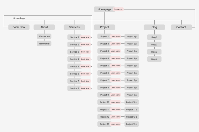

The new site map to resolve the issues:
Reduce the number of pages
Remove irrelevant unnecessary information from each page.
Add a CTA button on the first page.
Add CTA buttons to Services to facilitate user interaction.
Remove the repetitive information


After
The following problems were identified with the Information Architecture (IA) of the existing website:
Information was not on the page where users expected it to be.
Navigation elements were not helping users find what they were seeking.
Too much irrelevant information on the pages.
Inconsistent content hierarchy.
Before
Analyzing IA and creating a Site map
01 & 02
Problems
Solutions
03
Wireframe


In the first step, paper wireframes were created to quickly refine ideas and agree on the layout of each page.


04
Low-fidelity prototype
Digital wireframes were created to test and agree on general directions, clarify content blocks, and fix the website's structure.


